

Vir’s Photography
Landscape


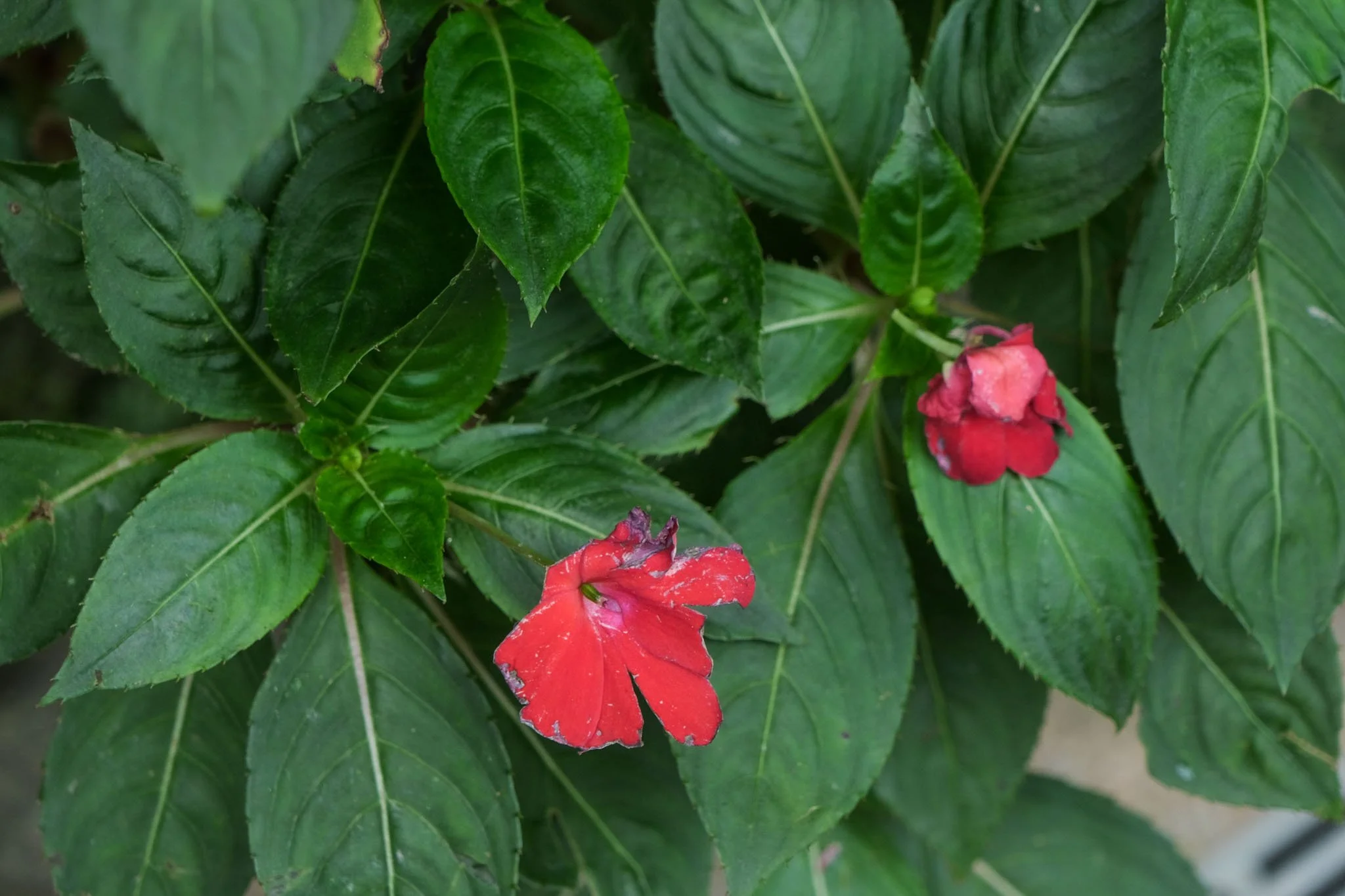


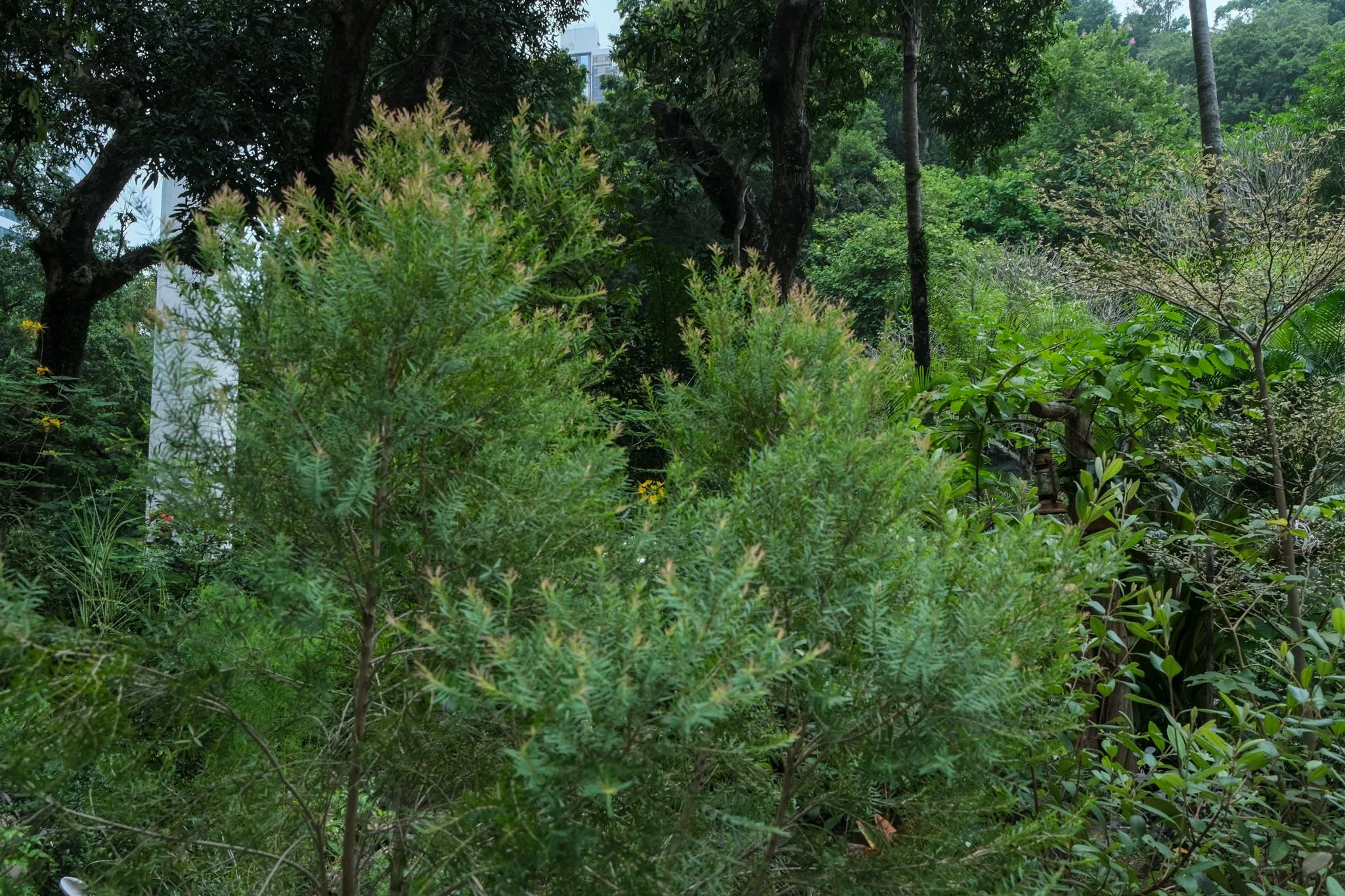


Tools used: Lightroom. Camera: Fujifilm XT3


Exposure Triangle
EXPOSURE TRIANGLE
The exposure triangle is a way to understand how light works when taking pictures. Imagine you have a big window and you want to take a picture of the beautiful view outside. The exposure triangle is like a special recipe that helps you get the perfect picture.
First, we have the ISO. ISO is like a light detector in your camera. It tells your camera how sensitive it should be to light. If it's a bright sunny day, you can set the ISO to a lower number, like 100. But if it's a cloudy day or indoors, you might need to set it to a higher number, like 800.
Next, we have the aperture. The aperture is like the size of the window in your camera. It controls how much light comes in. If you want a lot of light, you can open the aperture wide, like a super big window. But if you want less light, you can make the aperture smaller, like a tiny window.
Lastly, we have the shutter speed. The shutter speed is like a curtain in front of your camera's sensor. It controls how long the curtain stays open to let the light in. If it's a bright day, you can set the shutter speed faster, like 1/1000th of a second. But if it's a darker place, you might need to set it slower, like 1/30th of a second.
So, the exposure triangle is all about finding the right balance between ISO, aperture, and shutter speed to capture a perfect picture. It's like adjusting the recipe to make sure your picture is not too bright or too dark, but just right.
Special Effects


Tools used: Midjourney, Photoshop, After Effects, Lightroom, Davinci Resolve, Foldio360. Camera: Nikon D5100
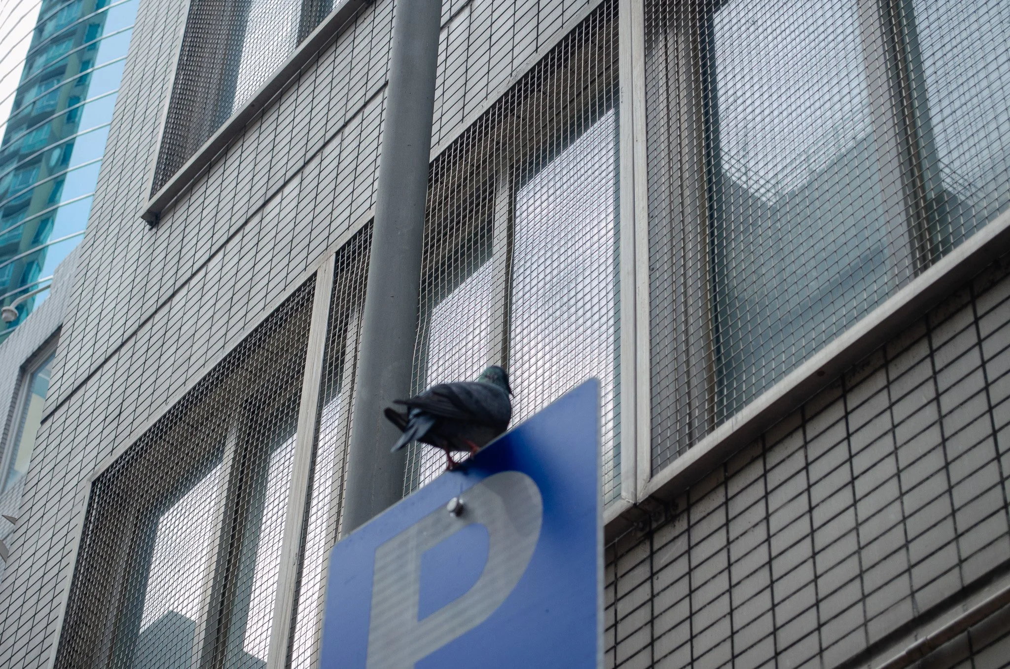
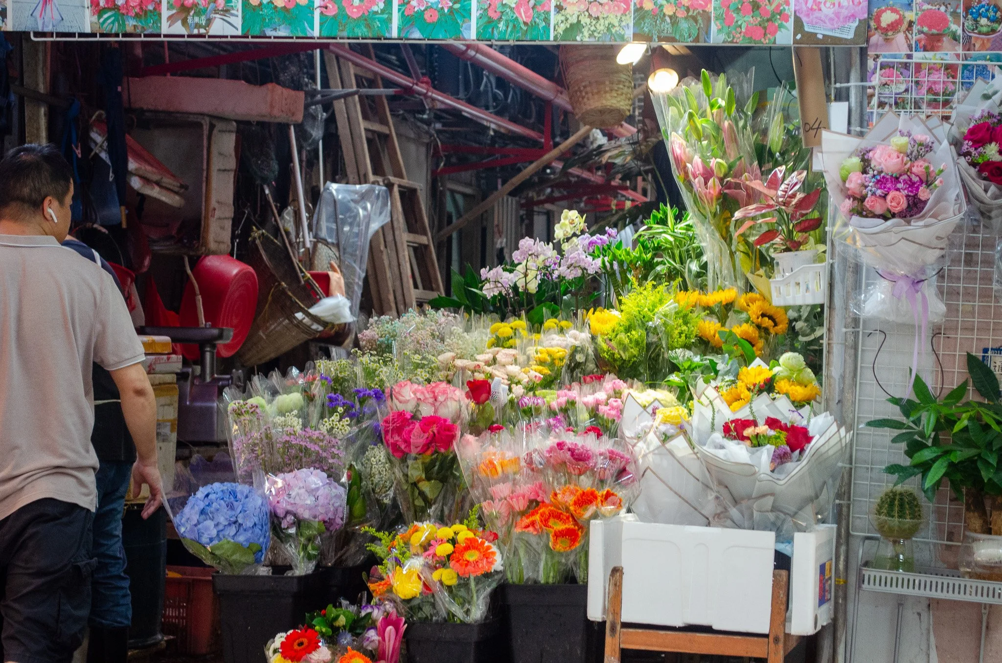
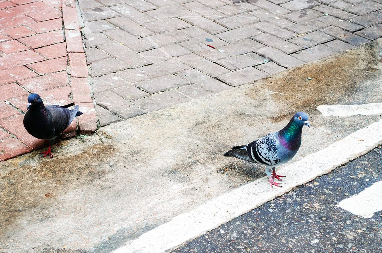
Street Photography

The Sunny 16 Rule is a simple way to take good pictures on a sunny day. It tells you how to set your camera so that your photos are not too bright or too dark.
What you need to do:
1. Set your camera's aperture to a number called f/16.
2. Set the shutter speed to a number that is the opposite of your film's speed. If you have a film with a speed of 100, set the shutter speed to 1/100 (or if your camera doesn't have that exact number, use the closest one like 1/125). If your film has a speed of 200, set the shutter speed to 1/200 (or use the closest one like 1/250). If your film has a speed of 400, set the shutter speed to 1/400 (or use the closest one like 1/500).
Why it works:
On a sunny day, the light is very bright. So by setting your camera to f/16 and using the right shutter speed, you can capture the right amount of light for a good photo. This rule helps you make sure your photos are not too bright or too dark.
Remember, the Sunny 16 Rule is just a guideline. You can always adjust your settings based on how you want your photo to look. But this rule is a great starting point for taking pictures on a sunny day.
Here are some other easy ways to set up your camera for different types of weather:


PASM Dial

A typical PASm Dial on a camera
The PASM dial helps you control how your picture looks.
P stands for Program mode.
When you choose this setting, the camera takes care of everything for you. It sets the right amount of light and focus, so you can just point and shoot.
A stands for Aperture Priority mode.
This is a fancy word for how much light comes into the camera. You can choose a big or small opening for the light, depending on the effect you want. If you want a blurry background, you can choose a big opening. If you want everything in focus, you can choose a small opening.
S stands for Shutter Priority mode.
This is all about how fast or slow the camera takes the picture. You can choose a fast shutter speed to capture something in motion, like a bird flying. Or you can choose a slow shutter speed to capture something like a beautiful waterfall.
M stands for Manual mode.
This is for the real photography experts. You get to control everything! You can adjust the light, focus, and shutter speed all by yourself. It's like being the boss of your camera.
Portrait Photography
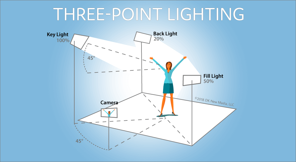
Illustration courtesy of Socialite- Lighting
THREE POINT LIGHTING IS A COMMON SETUP FOR PORTRAIT PHOTOGRAPHY AND CONSISTS OF THREE LIGHT
Key Light
The key light is like the boss light in a picture. It's the main light that makes the person in the picture look good. It shines on them from the side, making their face look nice and showing off their features.
Fill Light
The fill light is like the helper light. It's not as bright as the key light, but it helps get rid of any scary shadows. It goes on the other side of the person, making their face look even better without taking away the main light's magic.
Backlight
The backlight is like the cool light from behind. It goes behind the person and makes them stand out from the background. It creates a special glow around them, making them look extra cool and giving the picture a cool 3D effect.
So, when you take a picture, you use the key light to make the person look good, the fill light to get rid of scary shadows, and the backlight to make them stand out. All these lights work together to help you take good photos.
COlour Grading
Color grading is like using special tools to change the colors in a picture or video. It's done by experts who use special computer programs to adjust things like the brightness, darkness, and how colorful something looks. They do this to make the picture or video have a specific feeling or mood. It's a technique that is used a lot in photography and movies.
Colour grading allows you to influence emotions, establishing a theme, and crafting your own distinct identity as a photographer.
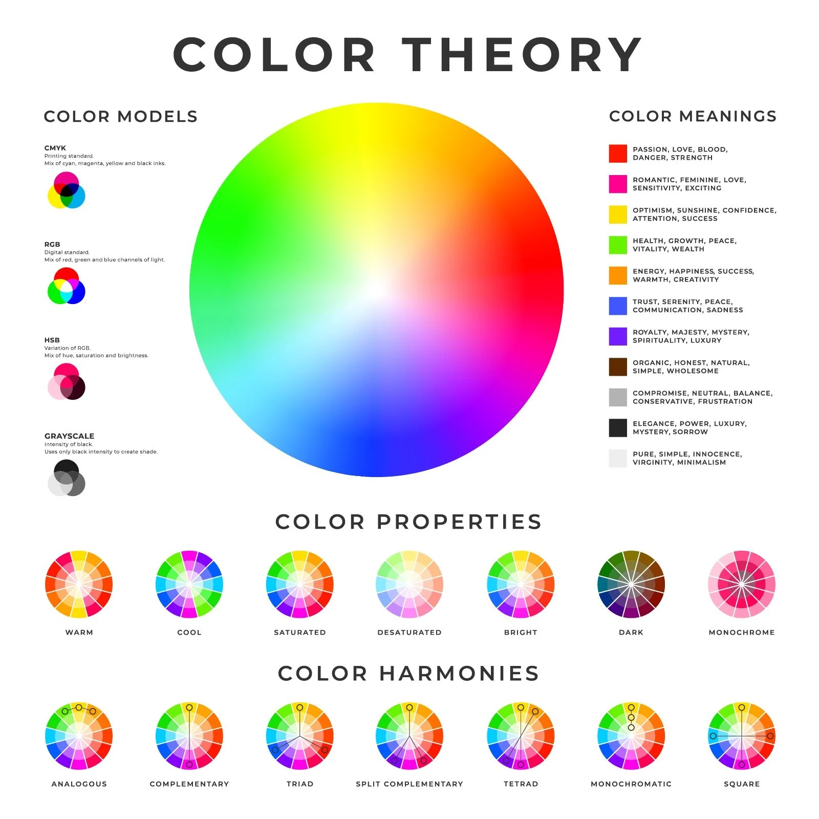
Types of Color Harmonies in Color Theory
Color harmonies in color theory refer to combinations of colors that are visually pleasing and create a sense of balance and unity.
There are several types of color harmonies:
1. Complementary Harmony: Complementary colors are opposite each other on the color wheel. They create a strong contrast and can make each other appear more vibrant. For example, red and green, or blue and orange.
2. Analogous Harmony: Analogous colors are adjacent to each other on the color wheel. They share similar undertones and create a harmonious and cohesive look. For example, blue, blue-green, and green.
3. Triadic Harmony: Triadic colors are evenly spaced around the color wheel, forming an equilateral triangle. They create a vibrant and balanced color scheme. For example, red, yellow, and blue.
4. Split-Complementary Harmony: Split-complementary colors are a variation of complementary colors. Instead of using the direct complement, it uses the two colors adjacent to the complement. This creates a color scheme with a strong visual contrast and a bit more variety. For example, blue, yellow-orange, and red-orange.
5. Monochromatic Harmony: Monochromatic colors are different shades, tints, and tones of a single color. This creates a harmonious and subtle color scheme. For example, different shades of blue.\\Color Properties in Color Theory
Color properties in color theory describe various characteristics of colors.
Here are some easy-to-understand descriptions of color properties:
1. Hue: Hue refers to the purest form of a color. It is what we commonly refer to as the color itself, such as red, blue, or yellow.
2. Saturation: Saturation, also known as chroma or intensity, refers to the purity or vividness of a color. Highly saturated colors appear vibrant and intense, while desaturated colors appear more muted or grayish.
3. Value: Value refers to the lightness or darkness of a color. It is often described on a scale from white to black. Colors with high value are lighter, while colors with low value are darker.
4. Tone: Tone refers to the relative lightness or darkness of a color compared to a neutral gray of the same value. It is achieved by adding gray to a color, resulting in a more subdued and less vibrant appearance.
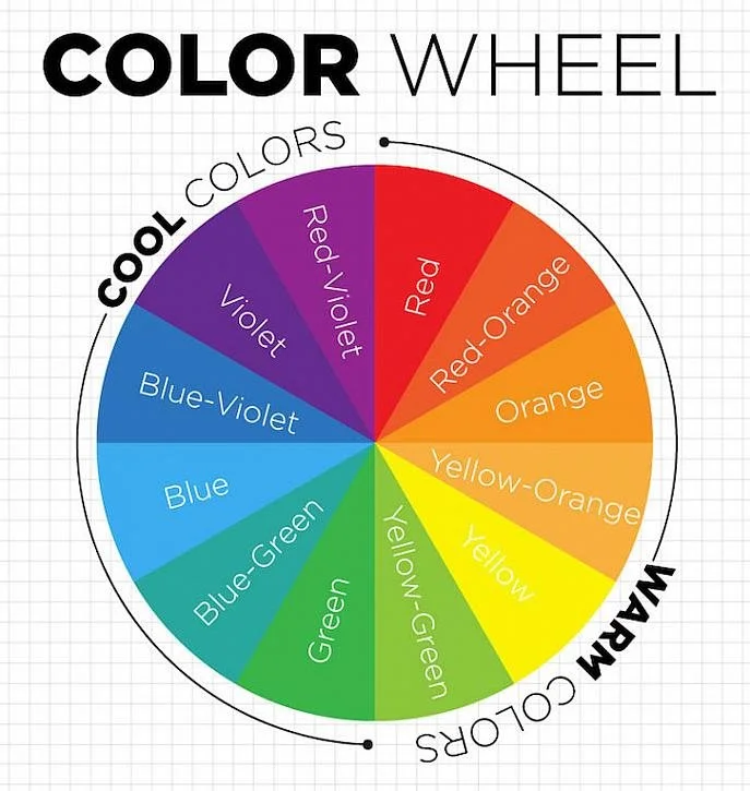
5. Temperature: Temperature refers to the perceived warmth or coolness of a color. Warm colors, such as red and yellow, evoke a sense of warmth and energy, while cool colors, such as blue and green, evoke a sense of calmness and tranquility.
Understanding these color harmonies and properties can help in creating visually appealing designs, artworks, and color combinations. Experimenting with different harmonies and properties can lead to interesting and aesthetically pleasing results.


Tools used: Midjourney, Photoshop, Lightroom

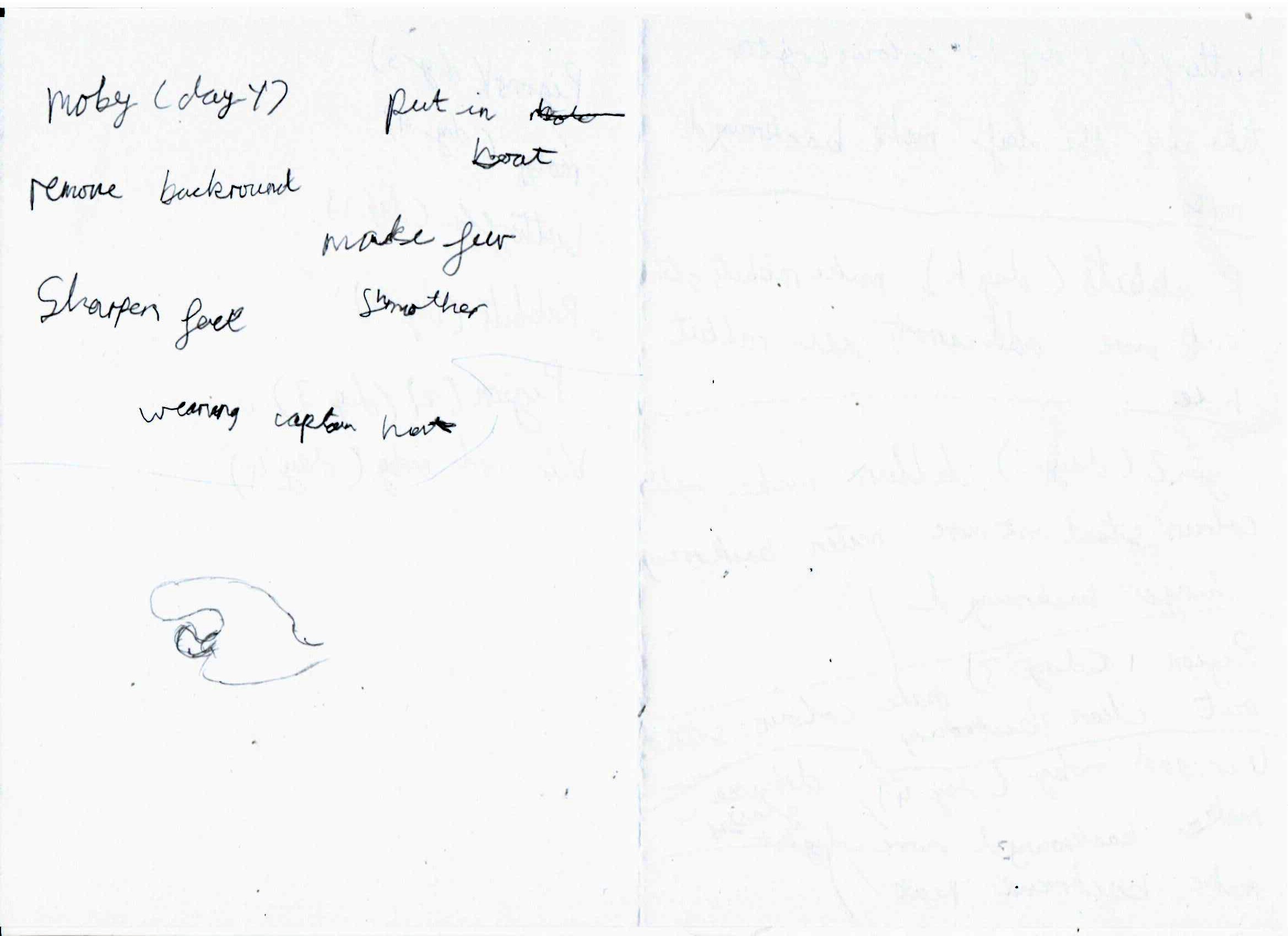
Choosing favourite images from the week of photography, followed by colour grading then generative image manipulation just for fun. The steps were 1. Choose images 2. Make notes on what to do with each image 3. Do the work to make the images as described in the notes.
Things to remember!
Handheld photography.
When you are not using a tripod, remember to stabilize the camera when setting up your shot. You are the tripod! Breathe in and hold it, take the shot, breathe out. This will minimize any small shakes of the camera, resulting in a sharper image.